Vibe Design Rescue

Professional UI/UX Design · Case Study

From Prototype UI to Premium Wellness Product Experience

A consumer wellness app had promising features — but the experience still felt like an early build. Our product design team redesigned eight core journeys for trust, clarity, and daily engagement.

8
Core experience areas redesigned
7
Before-and-after transformations
1
Net-new engagement surface
12
Polished post-redesign screens
Redesigned home screen — guided daily wellness companion
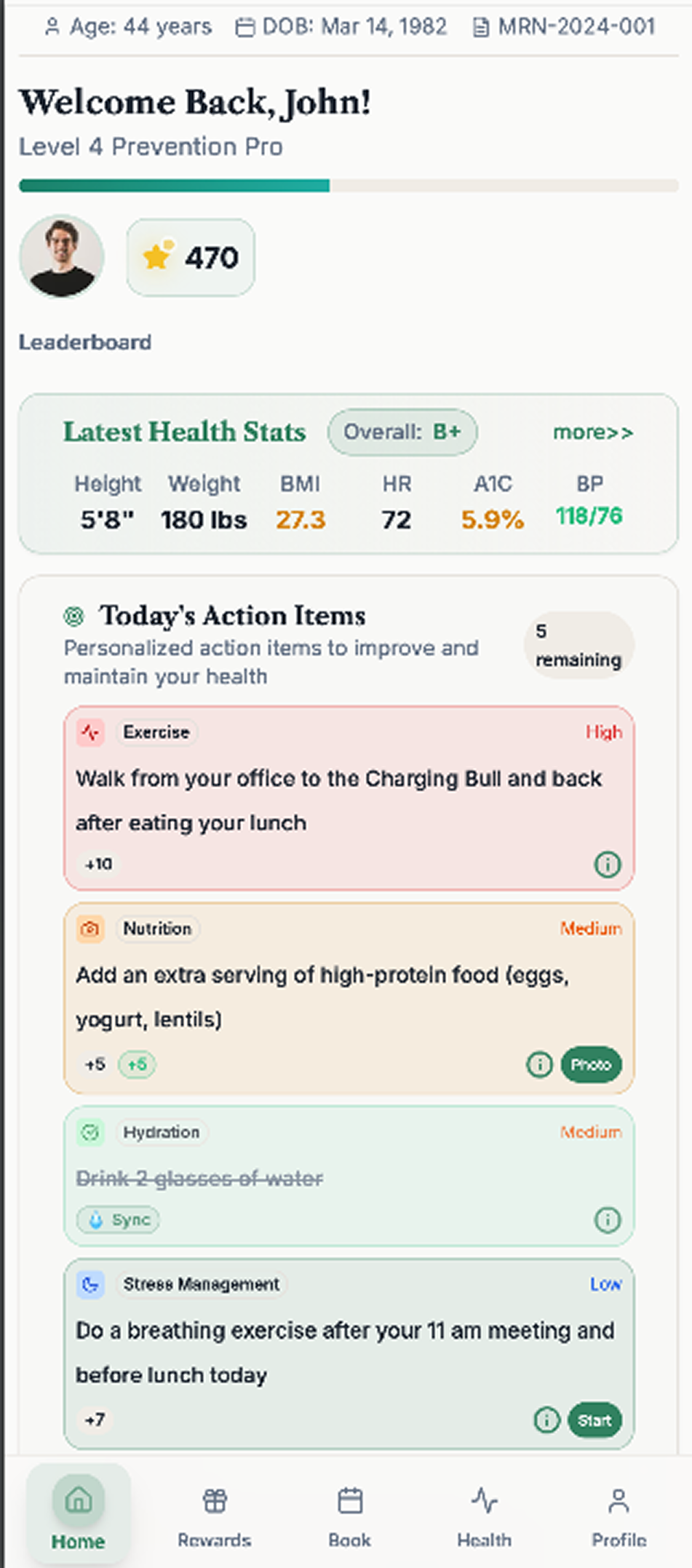
Original home screen — dense utility dashboard
Scroll to explore

The Challenge

A feature-rich app that still felt early

The product already shipped with ambition: health tracking, rewards, meal logging, breathing exercises, and account management. But the interface still felt functional instead of intentional — dense, flat, and utility-driven. Health data was hard to parse. Meal logging asked for manual work where users expected intelligence. Rewards looked like a list, not a motivation system. In wellness, that gap is the difference between activation and uninstall.

Before
Home · dense utility dashboard
Before
Rewards · flat list layout
Before
Health Stats · data dump
Before
Scan Meal · manual form entry

The Strategy

Not a visual refresh. A product UX overhaul.

We redesigned around clearer information architecture, stronger hierarchy, more premium art direction, and lower-friction task flows — so users are guided, not asked to work through the interface.

Clearer hierarchy

Stronger type contrast, spacing, and card structure so users scan quickly and know where to focus.

Progressive disclosure

Complex information layered from overview → detail → trend instead of dumped on one screen.

Lower friction

Fewer form fields, camera-first capture, and visible state transitions that make the system feel capable.

Emotional design

Warmer visuals, softer surfaces, and deliberate pacing for a wellness category that needs calm and trust.

Premium perception

Visual language that signals credibility — the difference between a product users try and a product they pay for.

Engagement loops

Progress modules, achievements, rewards, and challenges woven into the product — not bolted on.

Screen-by-Screen Transformation

Eight journeys, rebuilt

01 · Home

Guided daily companion, not a utility dashboard

The old home screen was a crowded utility dashboard. The new home acts as both an orientation layer and a motivation layer — answering the most important user question immediately: "What should I do next?"

  • Stronger type hierarchy and modular card architecture
  • Personalized progress modules surfaced up front
  • Next-best-action design drives daily return
Before
After
Before
After
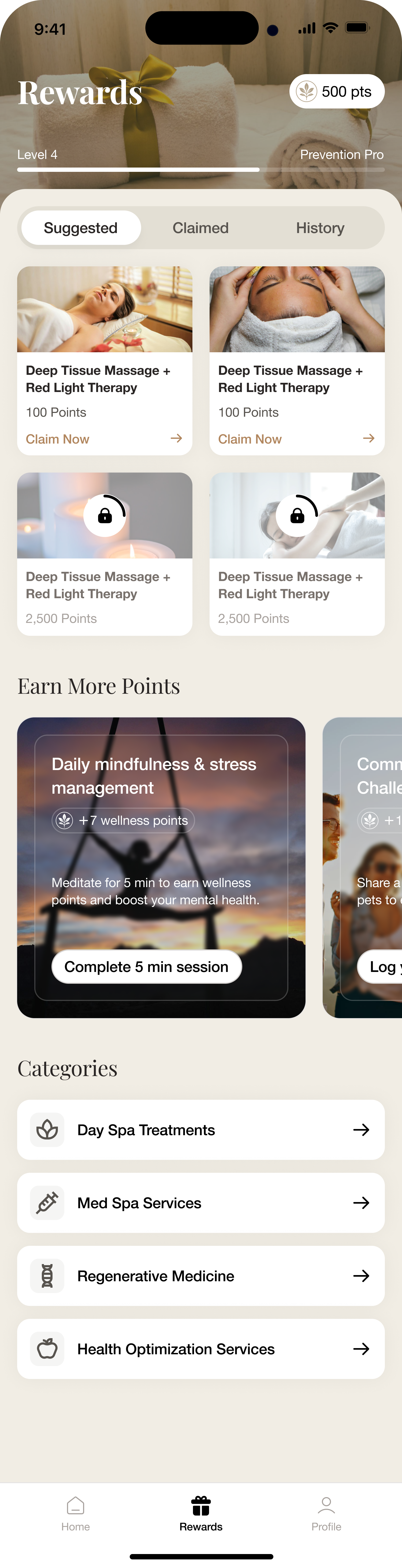
02 · Rewards

Motivation system, not a redemption list

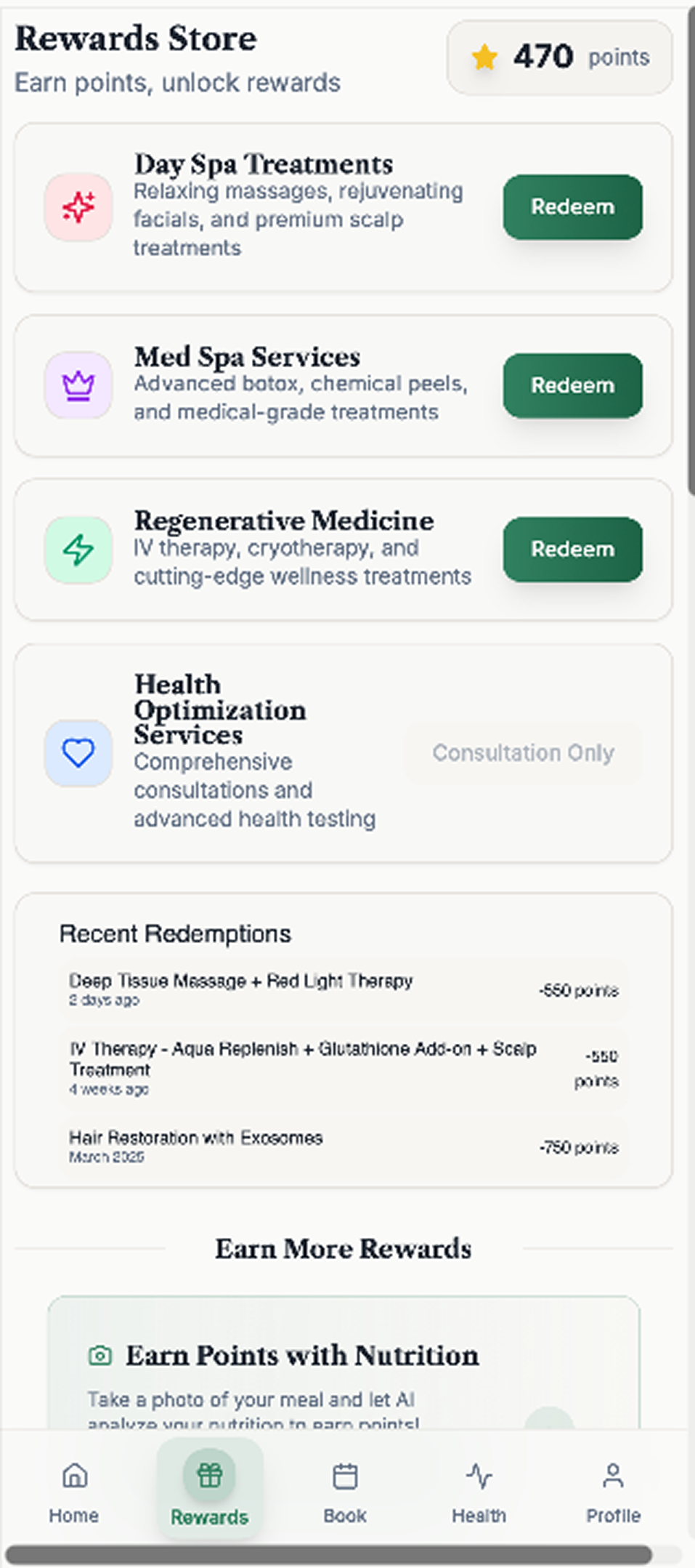
Rewards moved from a flat store layout to a compelling motivation loop. Featured offers, clear categories, visible point balances, and challenge-based earning give users a reason to engage — and a reason to come back.

  • Featured rewards carousel with category grouping
  • Point-balance and earn-path visibility up front
  • Engagement loop wired to challenges and progress
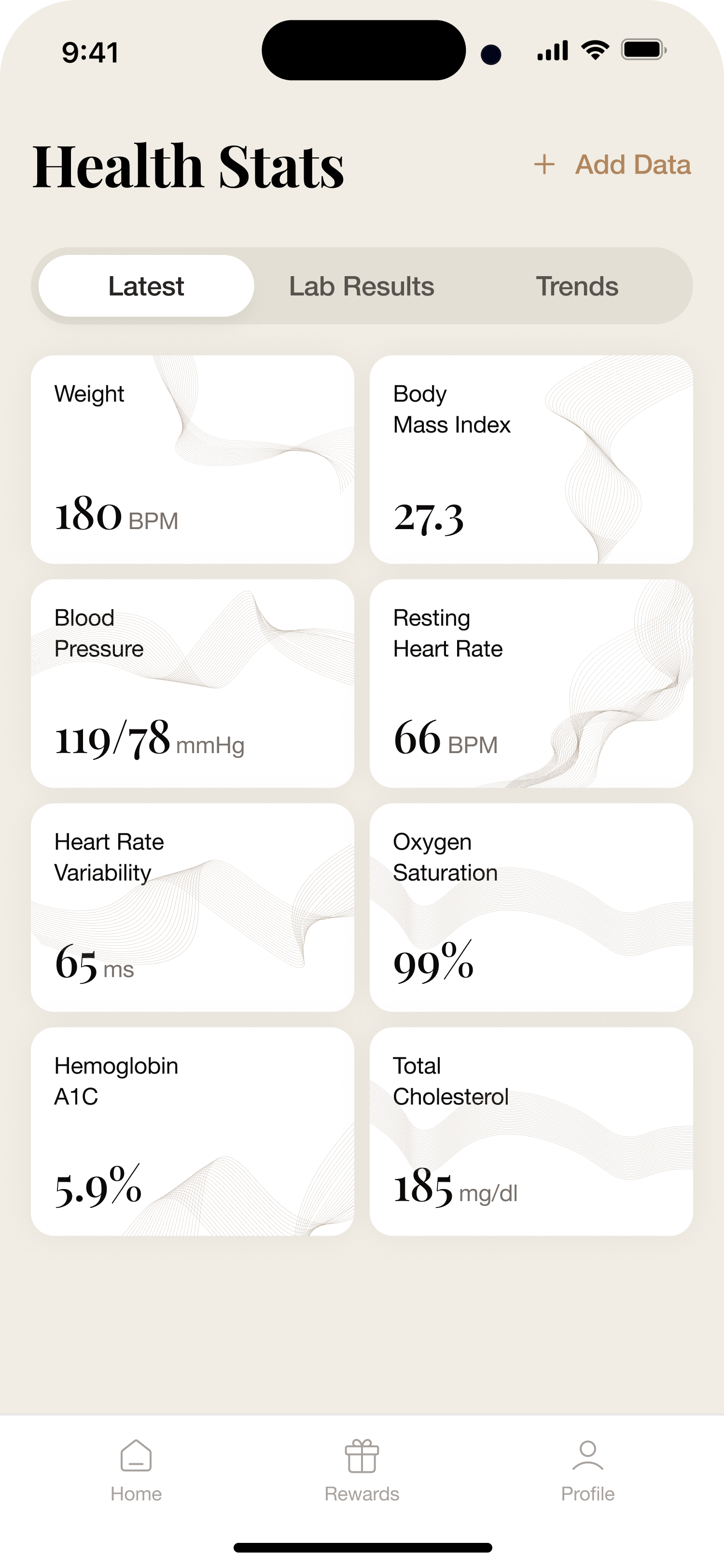
03 · Health Stats

From data dump to layered health intelligence

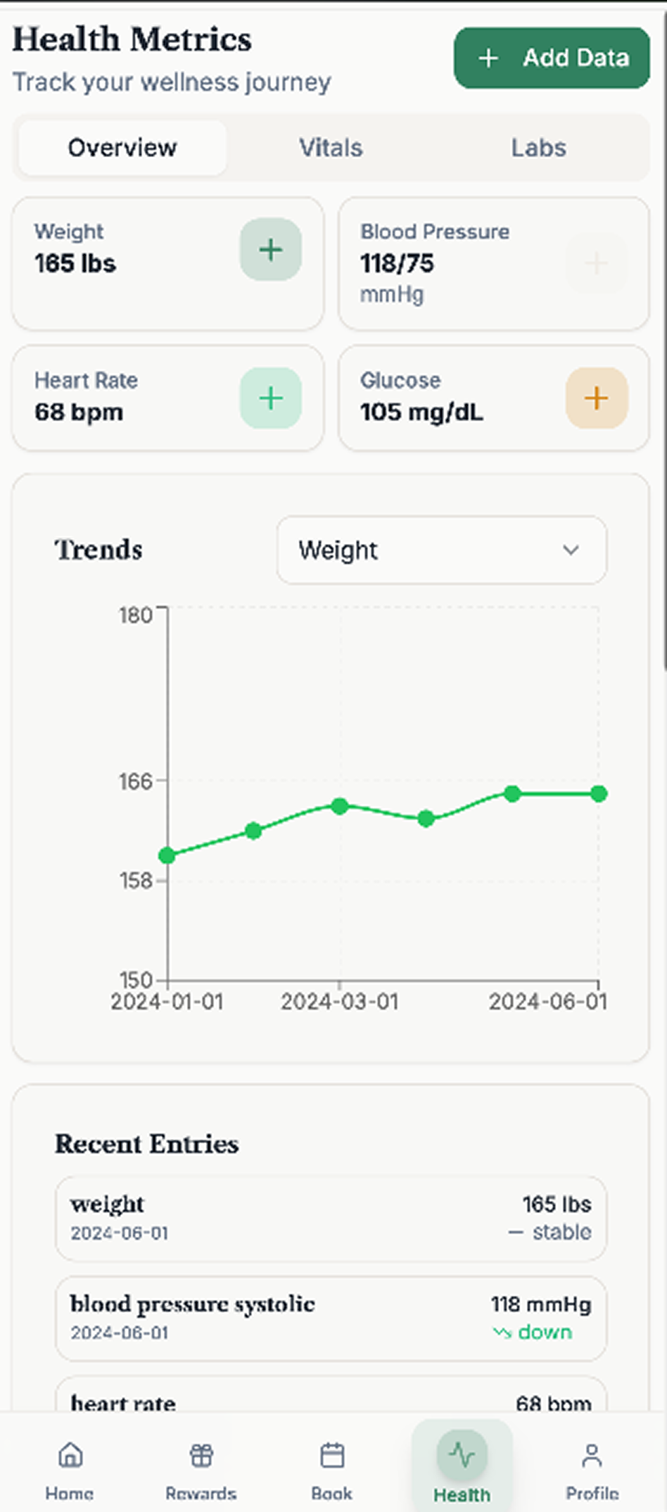
Health products live or die on comprehension. We rebuilt the stats experience as a layered system — overview, organized detail, and trends — so users can understand their data before being asked to interpret it.

Before
Single dense data dump
After
Overview
After
Organized detail
After
Trends & history
Swipe to explore all 3 views
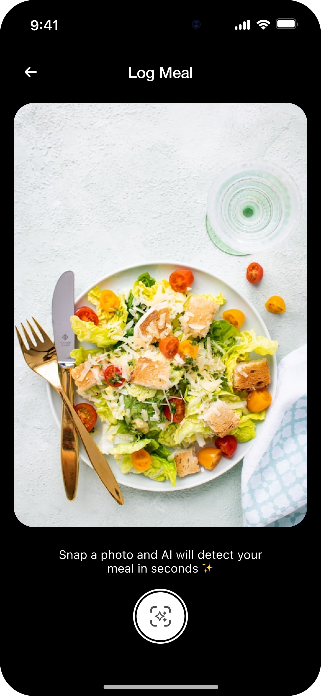
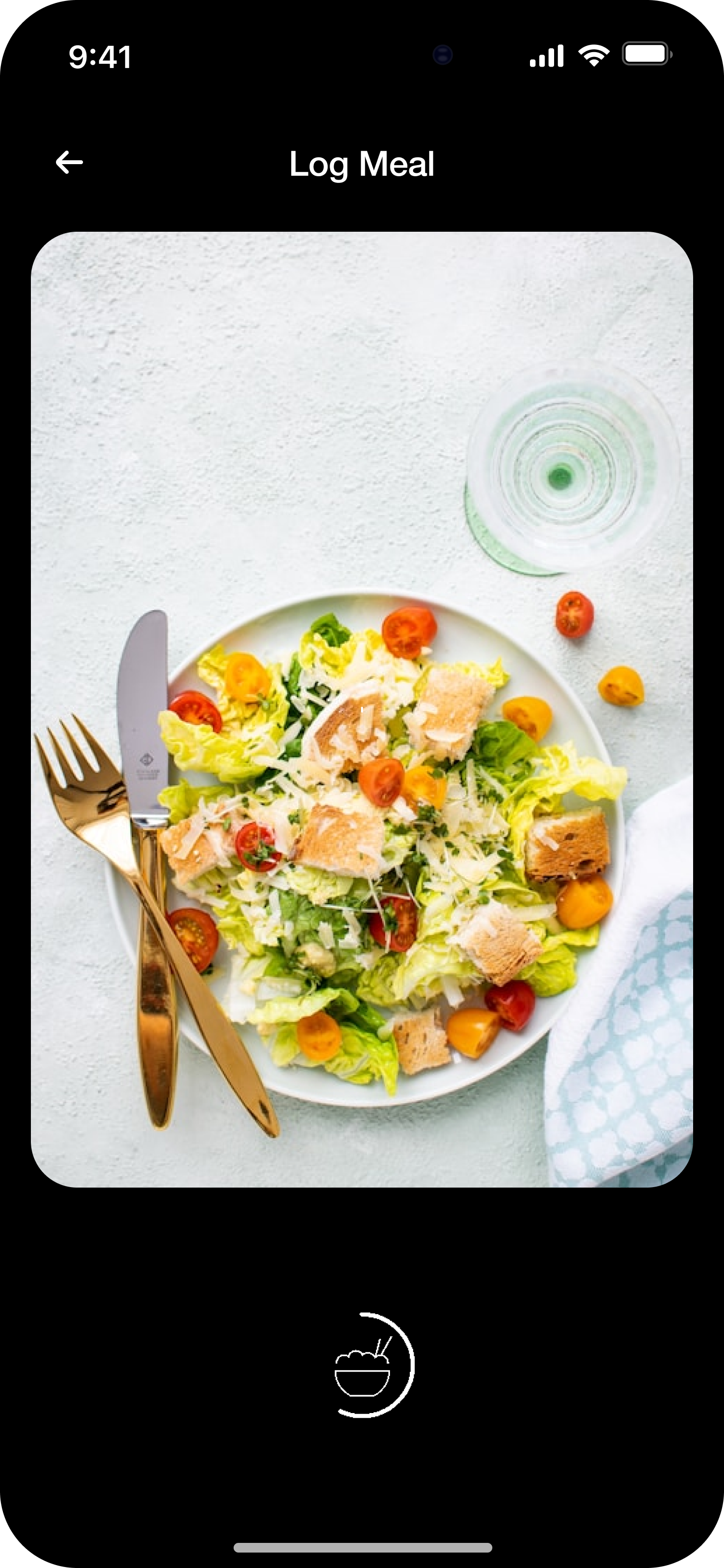
04 · Scan Meal

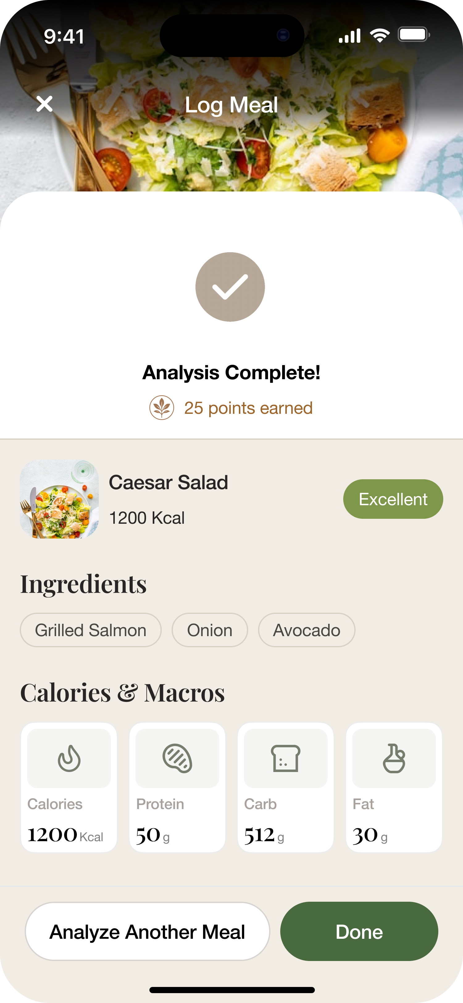
From manual logging to guided AI meal analysis

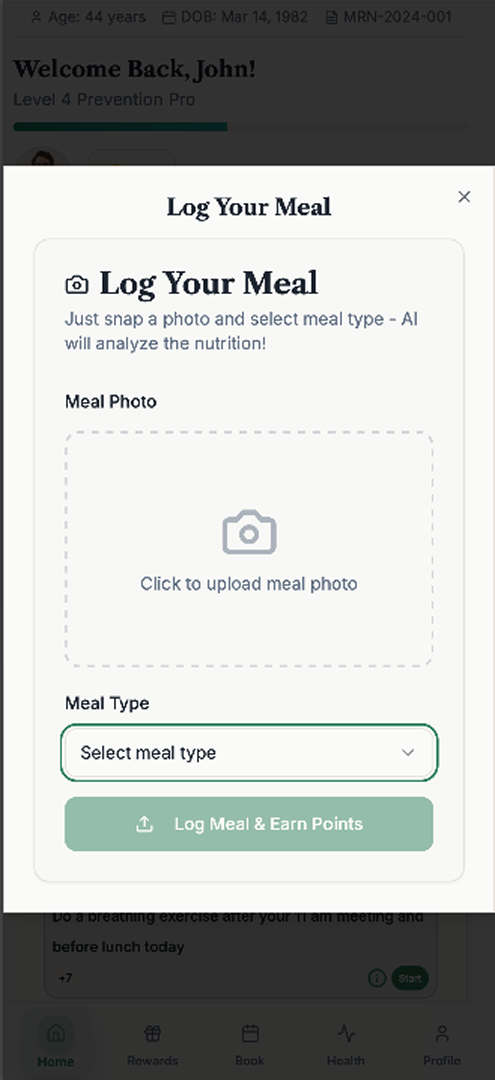
The old flow was admin work. The new flow is a camera-first sequence — capture, processing, result — with visible state transitions that make the AI value feel immediate.

Before
Old manual flow
Step 1
Capture
Step 2
Processing
Step 3
Result
Swipe through the flow
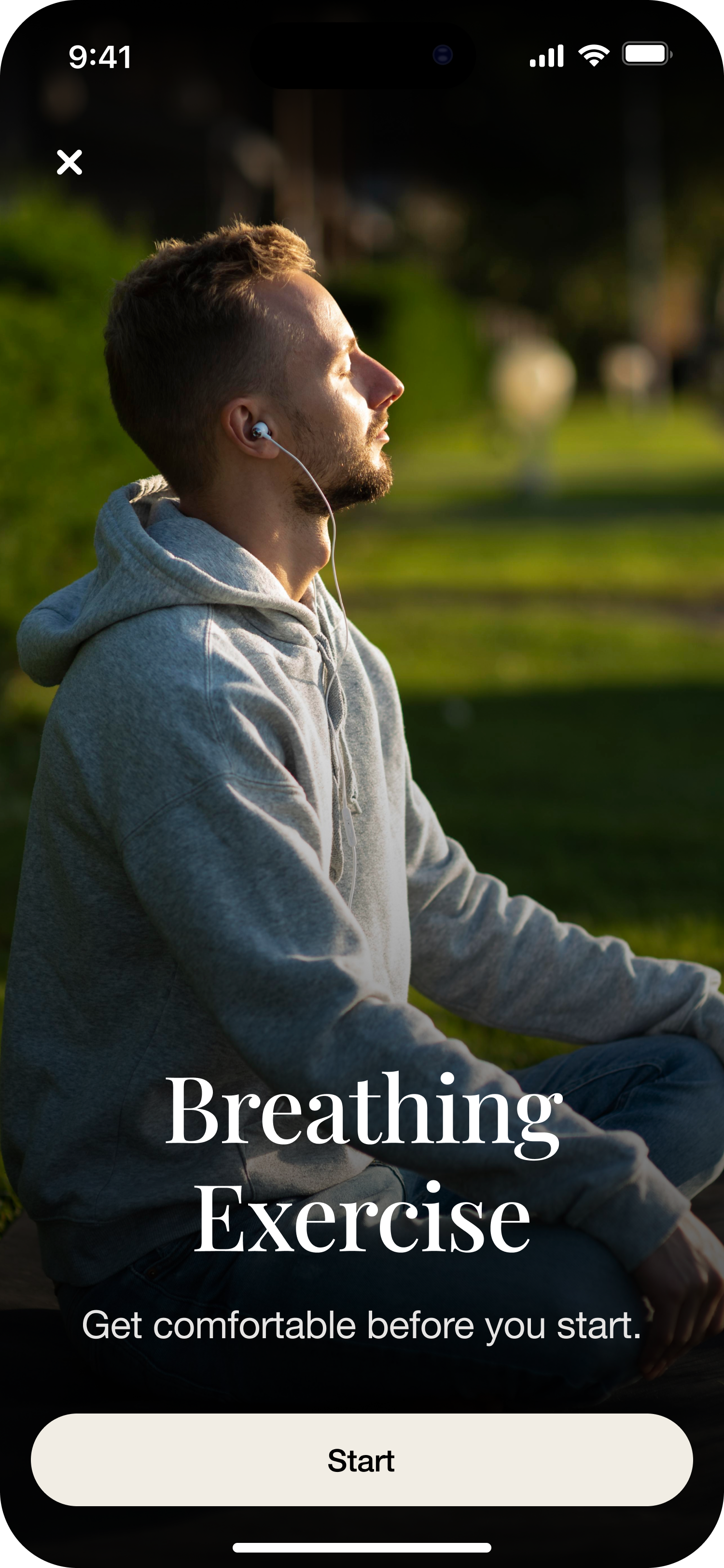
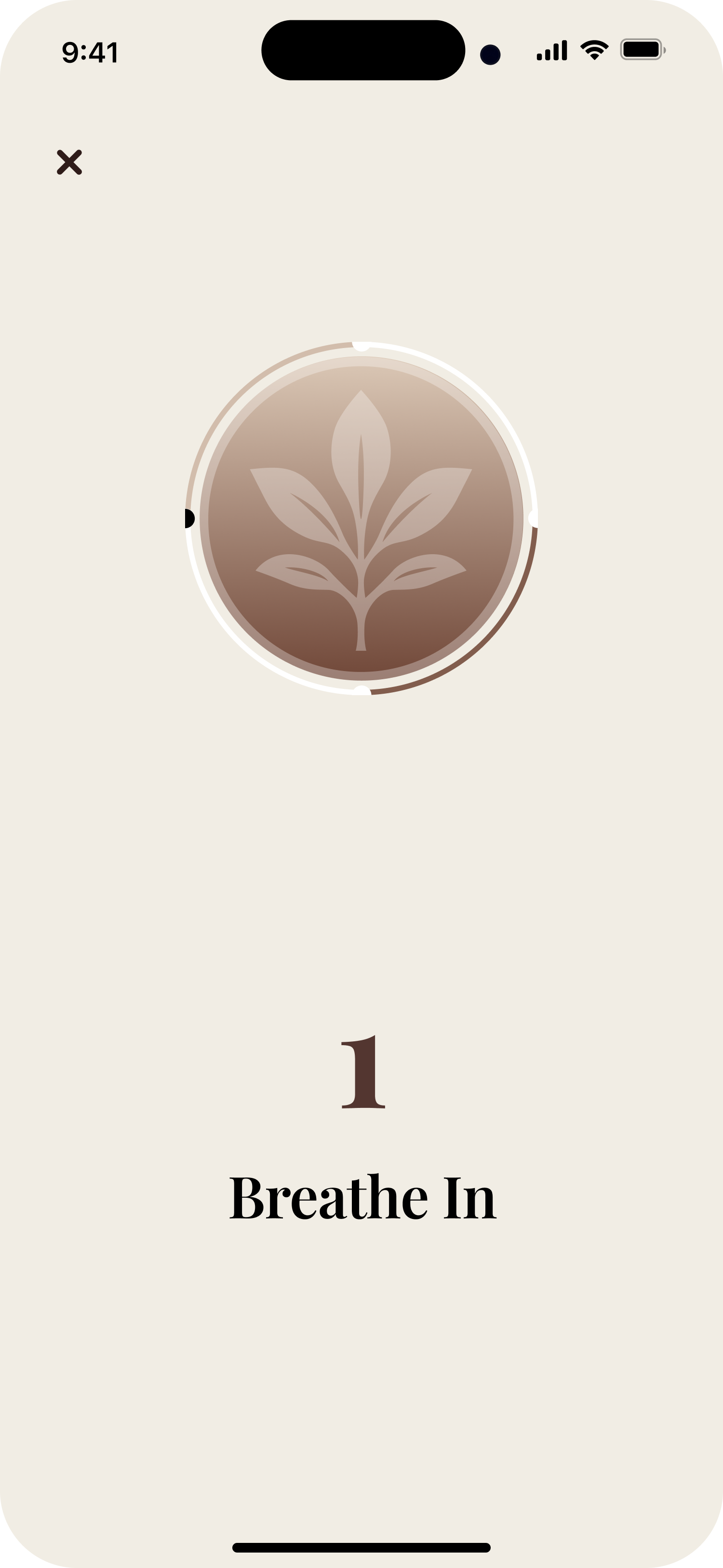
05 · Breathing Exercise

From utility screen to calming wellness ritual

A breathing feature should feel like a ritual, not a settings page. We rebuilt the entry point with calmer imagery, clearer focus, and a more supportive transition into the exercise itself.

  • Calm visual priming with contextual imagery
  • Focused CTA hierarchy and reduced distraction
  • Intentional, ritual-like entry into the exercise
Before
After
Before
After
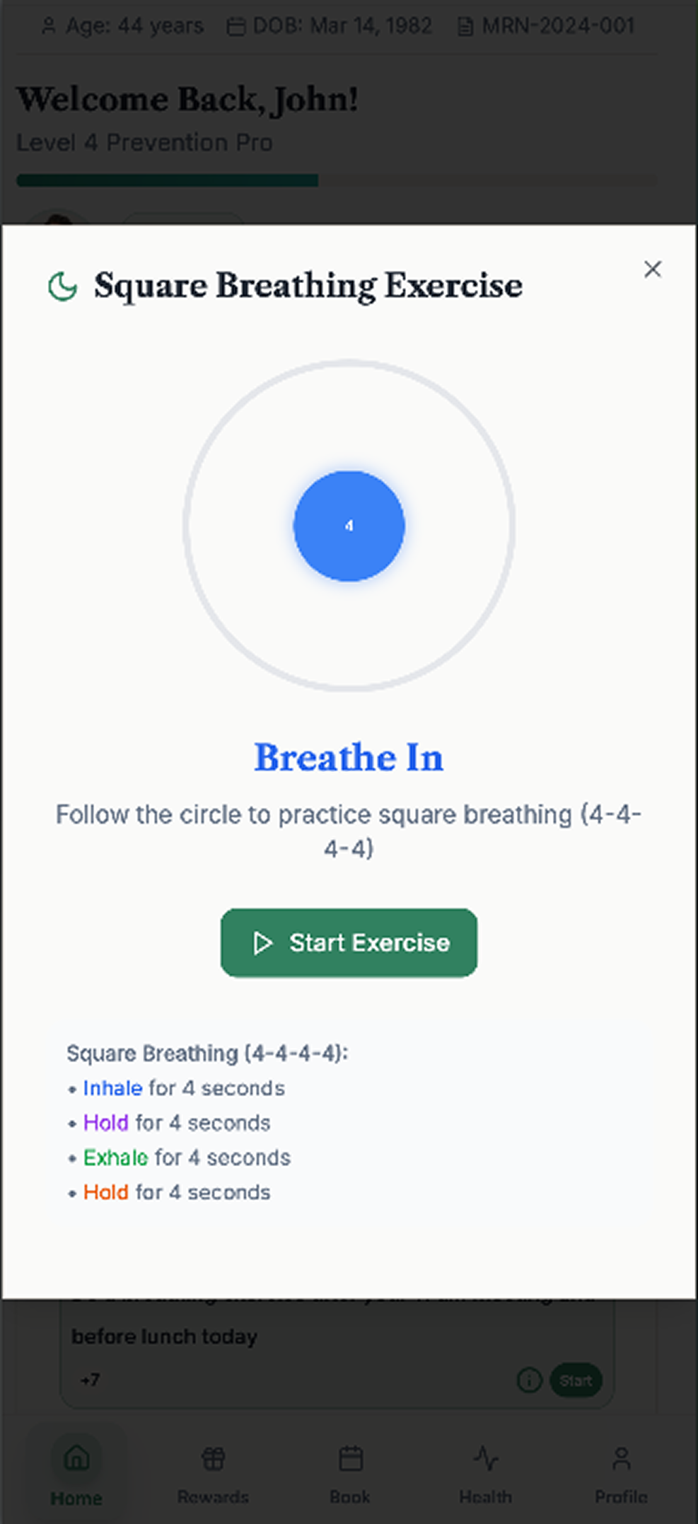
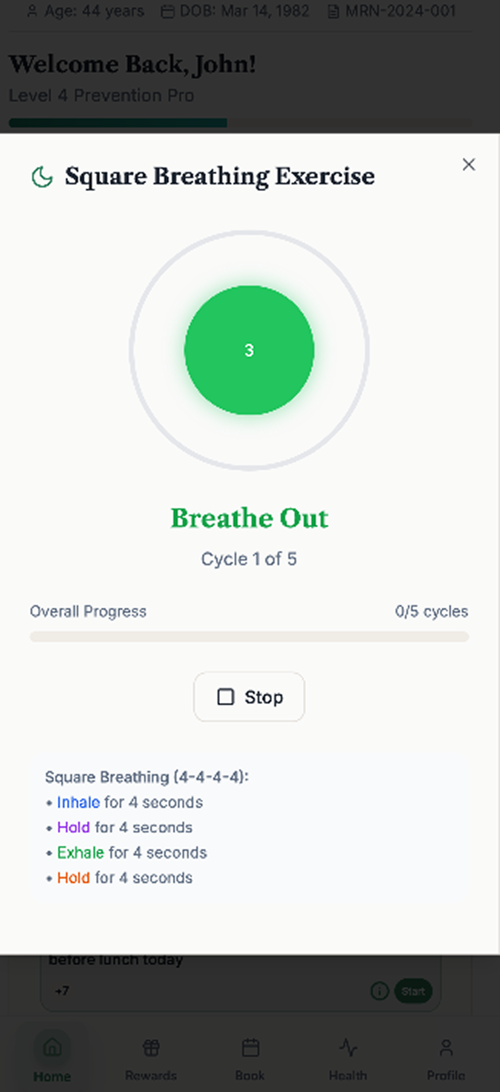
06 · Guided State

From cluttered instructions to focused guided state

During a breathing session, less is more. We stripped away unnecessary UI so the user can stay with the inhale/exhale rhythm — a calmer, more focused guided state that matches the feature's intent.

  • Minimal interaction design, zero distraction
  • Focus-state interface with calm motion framing
  • Lower cognitive load during the session
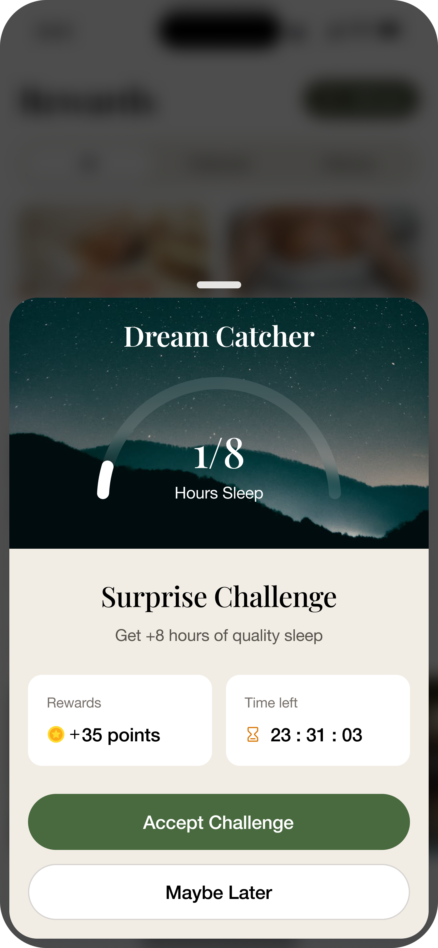
Net-new capability
07 · Challenge

A new retention loop — built into the product

Beyond redesigning what was there, we added a net-new surface purpose-built to drive return. It acts as a retention mechanic, a behavior trigger that pulls users back on a predictable cadence, and a bridge between rewards and recurring engagement — turning rewards from a passive catalog into an active goal worth chasing.

  • Retention mechanic — time-bound goals create a reason to open the app today
  • Behavior trigger — predictable cadence that compounds habit formation
  • Rewards bridge — earning activity feeds directly into the motivation loop
  • Monetization support — engaged users are paying users in a wellness subscription
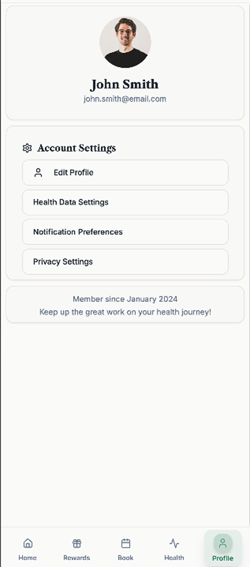
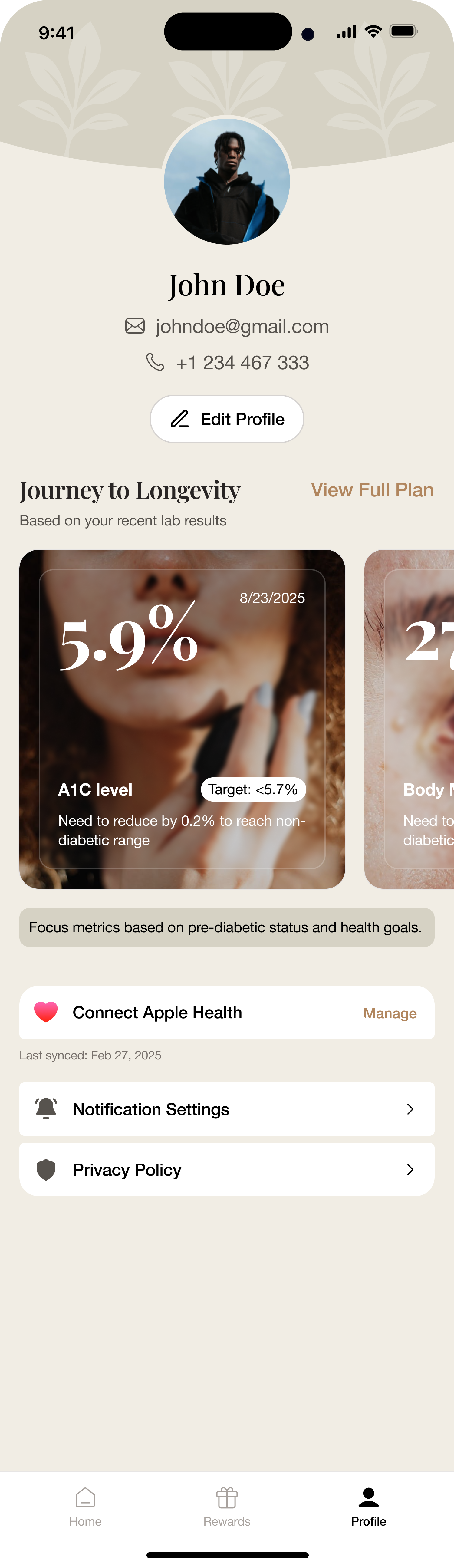
08 · My Account

From settings dump to value-centered hub

The account area used to feel like a dead end. The redesign reframes it as a user relationship hub — reinforcing the product's ongoing value through plan visibility, saved content access, and cleaner settings grouping.

  • Account as a value hub, not a settings dump
  • Subscription and plan visibility up front
  • Saved-content access and cleaner grouping
Before
After

Why It Matters

Designed to deliver

This wasn't a visual refresh. It was a product UX overhaul built to translate design work into product and business value.

Faster first-session comprehension — credibility before the user has to interpret a single chart

Higher trust for sensitive health data — a UI that feels safe to hand your biomarkers to

Lower friction in daily logging — capture in seconds, not form fields

Stronger habit loops — rewards, progress, and challenges that pull users back on day 2, 7, 30

Clearer premium perception — the polish that justifies a subscription in a paid wellness category

A scalable design foundation — components and patterns ready for the next feature, not just this one

MetaCTO's Role

Product design partners, not decorators

MetaCTO did more than make the app look better. Our product design team reworked the experience at the system level — improving structure, flow, visual language, and feature usability across the product. The work focused on turning a promising feature set into a coherent, usable, and commercially credible product experience.

We help companies close the gap between a product that functions and a product that feels ready to trust, use daily, and pay for.

The same team that rebuilt this product experience helps founders turn rough but promising apps into products that feel launch-ready and investable.

Why Choose MetaCTO?

Built on experience, focused on results

20+

Years of App Development Experience

100+

Successful Projects Delivered

$40M+

In Client Fundraising Support

5.0

Star Rating on Clutch

A promising product should not feel like a prototype.

If your app works but still feels like an early build, MetaCTO's product design team can help close the gap — turning a promising feature set into an experience users trust, understand, and return to.

No spam 100% secure Quick response

Expanded view